Website Design, Development, and Usability
U.S. Treasury
The U.S. Treasury developed the myRA (My Retirement Account) program as a simple, safe, and affordable way for people—especially those without access to a retirement savings plan at work—to start saving. Working within a very aggressive project schedule, A&T managed the design, code development, usability testing, and ongoing project support for www.myra.gov. Not only did A&T meet and exceed client deadlines, we created an easy-to-use and easy-to-read website which met all applicable federal accessibility standards, producing a design which provides all audiences the same access to the website’s core functionality.
The myRA website is designed to introduce this "beginner IRA" to U.S. workers, especially those who do not have access to a retirement savings plan through their job. This presented a particular challenge: discussing financial terms and accounts to those who are completely new to the concept of long-term saving.

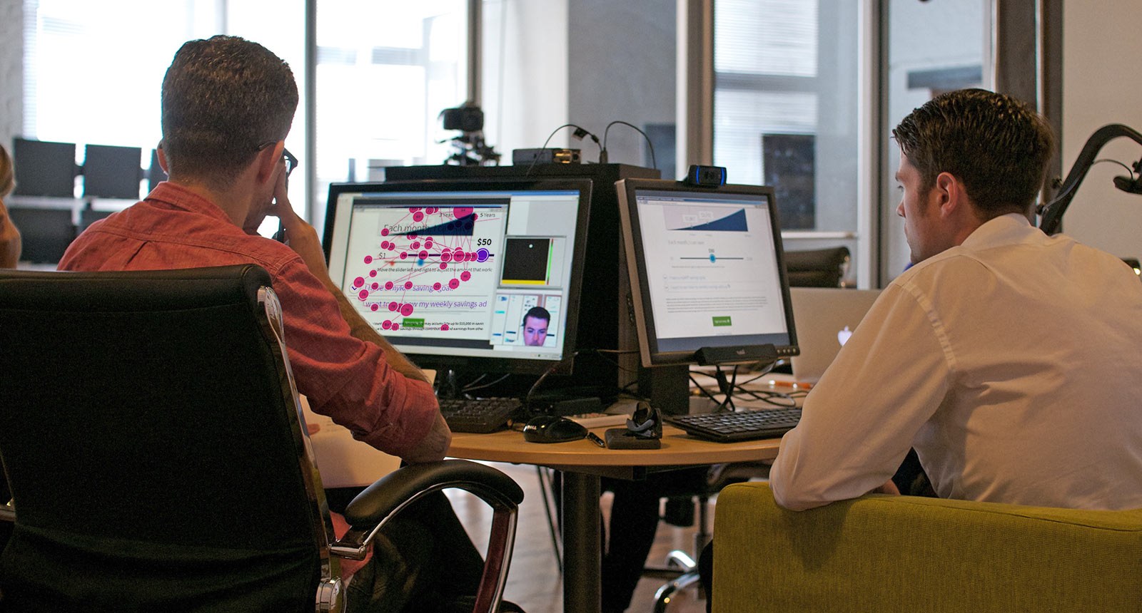
Usability testing throughout the design and development process was key to understanding the wants and needs of the audience. In addition to gathering subjective feedback via focus groups and Q&A sessions, Alex & Tom, Inc. utilized special eye-tracking cameras to record real users navigating around the site. That yielded valuable objective data about the design and wording used on the site.

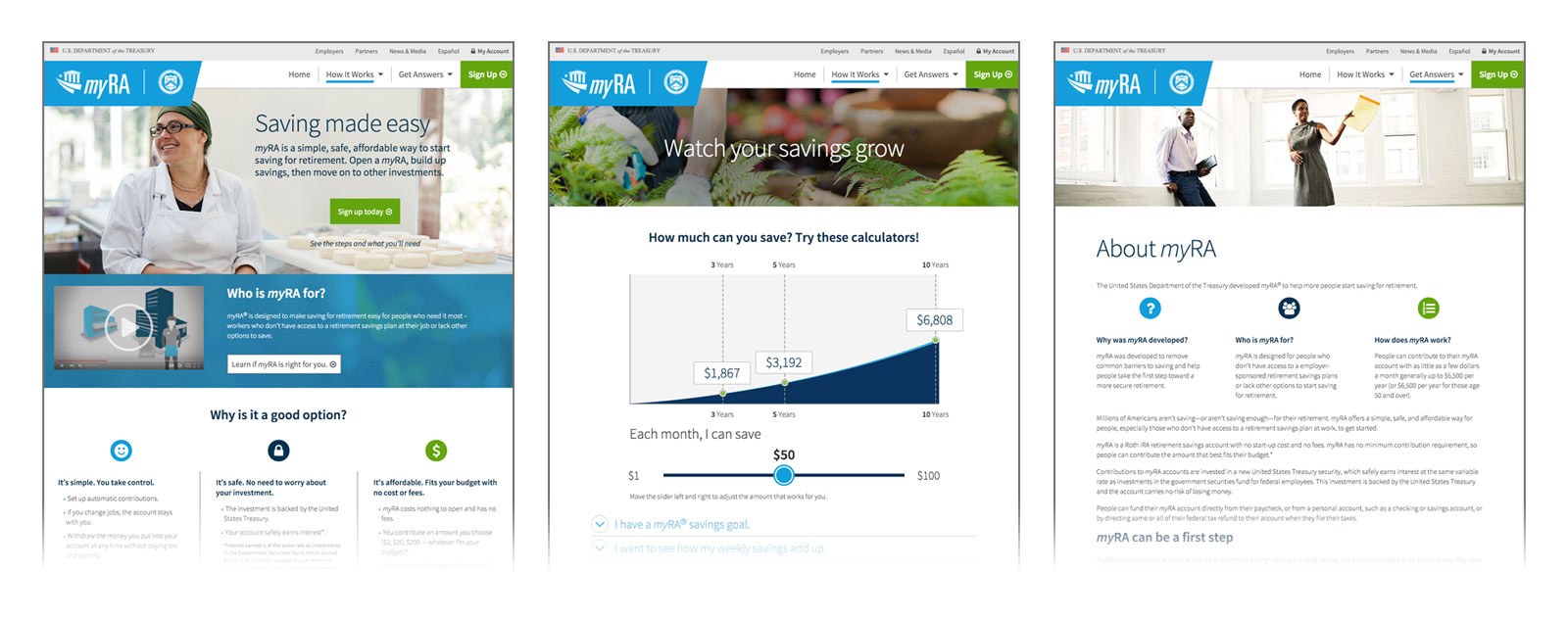
A popular feature of the website was multiple interactive savings calculators which, in plain language, helped savers visualize how their monthly or weekly savings could significantly add up over time. All calculators were built to work not only with a mouse and keyboard, but with smartphone and tablet touchscreens, too.

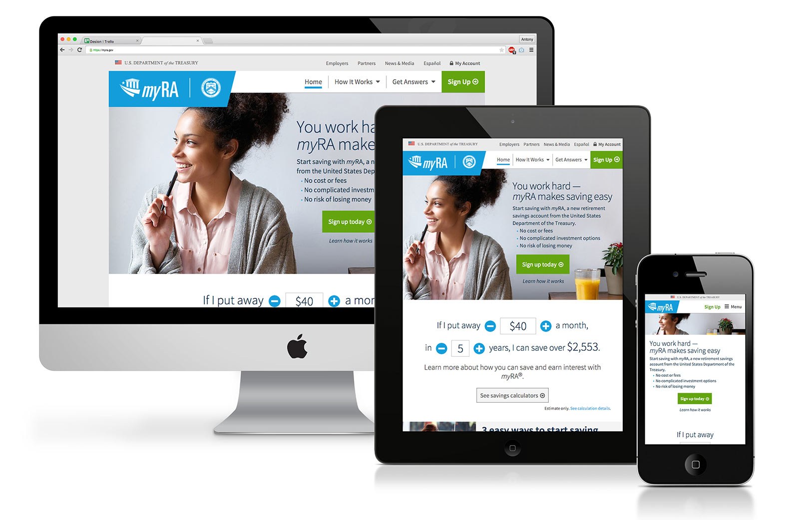
The end result was the successful launch of myRA.gov, including intuitive navigation and easy-to-find calls to action for enrollment. A&T conducted extensive research to ensure an optimal user experience and aesthetic, from wireframe layouts through design and code development. In addition to an engaging experience and clean interface, the site was coded to be responsive so it could be equally usable across desktop, tablet, and mobile devices.

